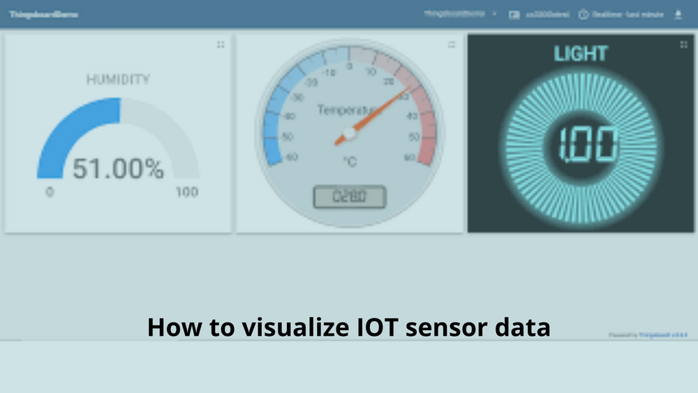
How to visualize IOT sensor data
Hello People. This article discusses how to visualize IOT sensor data. You might be already aware of how to collect data from IOT sensors and store it in AWS DynamoDB with Raspberry Pi. This post describes how to pull this data from the database and visualize it.
While this data is available through the AWS console and API of the development server, this is not an ideal way to visualize the data. We can do this using React Website and a Javascript libarary called Chart.JS. This process can be split into two main parts: first, pulling the data from the database as well as transforming the data so that it can be presented in a browser, and second, rendering this transformed data in React application with Chart.js.
The data tools from Chart.JS provide option to format the data as chart, list, table, or a single aggregated value. The chart object is formatted in the format used by Chart.js. The lists and tables are collections of either charts or aggregated values.

To deliver this data to the browser, we need a simple development server. The server is responsible for fetching the data-points from the database and processing them according to the instructions provided in the topic metadata. The web app responsible for the visualizing the data fetches the processed data from the development server on page load.
Are you looking to start your business in the electric vehicle industry? We provide software development, web application development, mobile application development, charging stations management app, electric vehicle fleet management software development, cyber security and all software services. Please check our home page here https://iwheels.co/

Ok. Let's get back to the article.
Now let us look at how to visualize the data. The transformed data can be visualized with web application implemented with React using Material UI components. The Material UI library is a React component library implementing Material design. It provides fast and easy way to create scalable mobile friendly applications. The Material UI library also provides easy to use theming with professionally designed look and feel.
The charts are handled by re-chartjs-wrapper, a small wrapper library for creating and updating Chart.js Chart objects and their canvas elements as React components. This is necessary as Chart.js is generic JS library, instead of a React component library. The wrapper library passes through the data to the chart library, which handles the actual rendering.
To make the visuals colorful, the colors are defined with chartjs-plugin-colorschemes Chart.js plugin. This plugin provides some default themes, but I decided to use custom color set from the Material palette.
The above output can also be achieved in a simpler way using Grafana. Hope this article on How to visualize IOT sensor data is useful to you. Please also read about IOT Timestream data with Grafana